Index
Cleaning Scans
Typesetting
Saving Files
Advanced Stuff
1. Cleaning Scans
1.1) Crop/Rotate
The very first step after you open a raw image (assuming it’s grayscale, if not, grayscale it, unless it's a color page obviously) is to crop/rotate. Some people, in order to maintain a down-to-the-pixel height and width, prefer to do things really clumsily. Instead, the easy way is to just use the crop tool. If it's a 2pg raw and there aren't frames that span both pages, select the first page by roughly drawing a rectangle around it with the crop tool. What will be cropped off will be darkened. Now, manually adjust the sides to darken excess areas to crop them off. Find one of the longer straight lines on the page (frame borders) to act as a guide for rotating. Still using the crop tool, move one of the rectangle legs against this line, then rotate (move cursor just outside rectangle until curvy rotate pointer shows up) so that the crop rectangle is lined up with this straight line. Move the adjusted leg back to allow some margin space, then finally crop. This should leave you with your desired single page, rotated so that it looks straight. Since sometimes lines get warped and frame edges that should be parallel are not, zoom out to make sure the page looks straight, and if not, rotate again. You may just have to find the happy medium where, although crop rectangle edges do not line up with any of the frame edges, the differences on opposing edges cancel each other out so the overall page looks straight.

Note how, on the left, the raw image is clearly not properly rotated, as compared to the vertical line of the crop rectangle edge. By rotating the crop rectangle until it is parallel with the edge, you can ensure that your final image is properly aligned.
Be careful, sometimes when there is art flush against the edges, if you rotate and don't adjust the crop rectangle properly, you will be left with thin white triangles in the corners. There are two ways to fix this. The first, and easier way, is to just make your crop rectangle smaller. Crop off art as needed to ensure that you don't have this white space. Try to crop off as little as possible, a nice way is to just make sure that your rotated rectangle edges intersect the original edges where the art ends. The second, somewhat more tedious way, is to just crop it so there are white triangles. Then, either using clone stamp or manually redrawing the art, fill in the triangles.

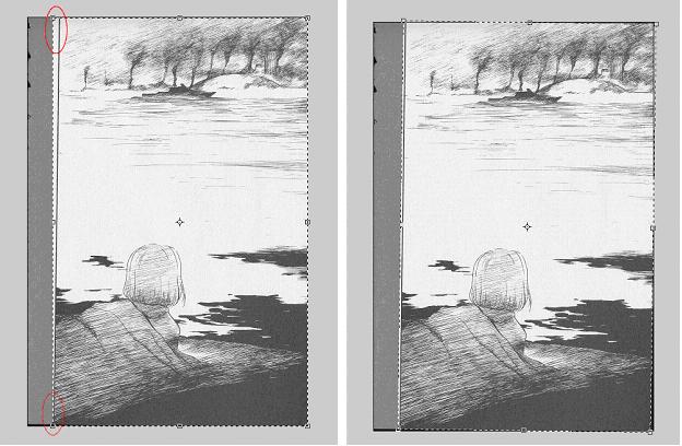
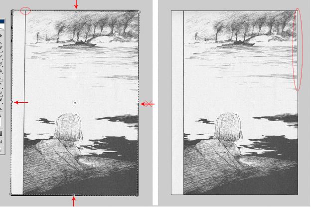
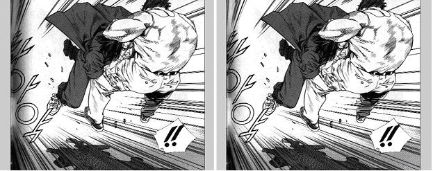
On the left image, the left edge of the crop rectangle was moved back near its original position to restore the margin. The top and bottom edges were moved inward to ensure the corners were within the art, while the right edge was intentionally left in its original position. As you can see, failing to adjust this edge results in the white wedge seen in the top-right corner of the right image. A minor note – in order to preserve as much art as possible, the crop rectangle does not need to be entirely within the page edges. As noted in the circled region on the left image, since the art terminates at the frame edge, so long as the crop rectangle is within the page up to this point, the area left of that frame edge can be outside the page, as it will default to white anyways.

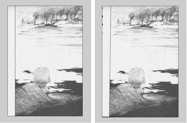
Final crop on left, as compared to original raw on right.

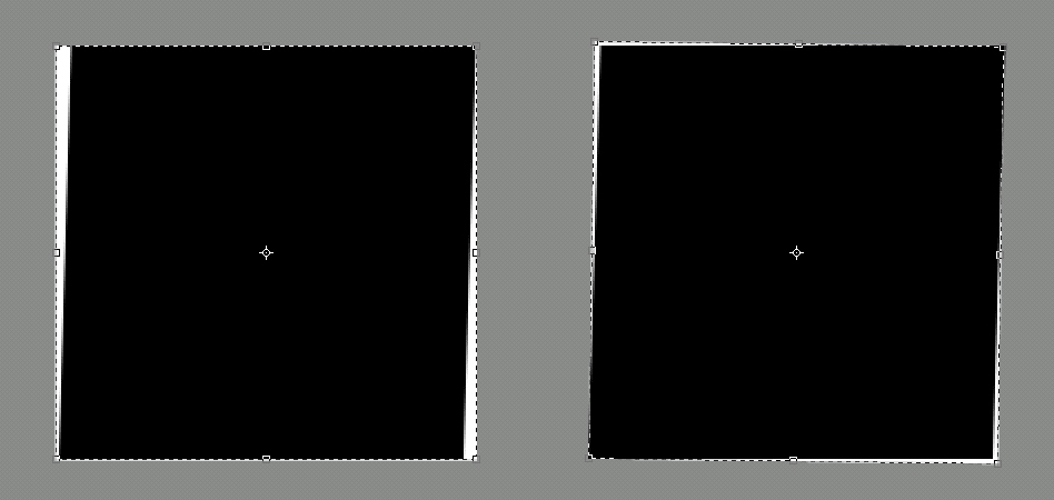
An exaggerated example of why crop rectangles can give better rotation than single edge alignment. If you use the ruler method or other rotation methods and line up the page along one of the frame edges, you can usually get things pretty close. Most pages, however, have corners that aren't exactly orthogonal, and the frames will actually be parallelograms and not rectangles (usually you need to be at several hundred percent magnification to notice). On the left, you can see, if you use the top/bottom edge to align, then the sides won't be straight; ditto if you align using side edges. With a crop rectangle though, you can try and balance the error for a slightly better end result, as seen on the right. In practice, this difference may be unnoticeable, since the error may only be a pixel or two, so if you're feeling lazy, one edge may be enough.

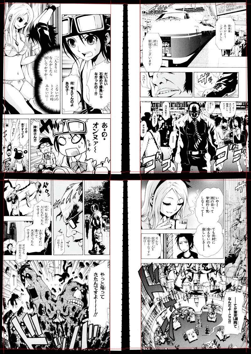
An actual example of the above. These are real scans, unedited beyond some resizing and the addition of the vertical and horizontal guide lines. Note how, although one edge seems vertical, the others are not. If you align by this one edge, you would be forced to crop off all the art outside the red guide lines, whereas compromising lets you sacrifice much less art. On these pages, one might reason that even if you did crop it off, no one would know, but on pages where the art does not go flush to the edge on all but one side, the issue of which margin to set as the gold standard can become more complex.
If there is no art contacting the image edges, also use the crop tool to center the page by evening out the margins. For example, if there is a wide right margin, but a thin left margin, adjust the crop rectangle positioning to try and get the left and right margins the same width. It may be easier to do this as a separate step after rotation cropping, and sometimes after levelling; an easy way to also preserve image size is to simply zoom out, drag a crop rectangle around the entire image, then simply move the crop rectangle in the appropriate direction (in this example, left; hold shift as you drag to make sure you don't accidentally move the rectangle up or down unless you intend to). This also applies to top/bottom margins.
When you're all done, make sure to check the edges of the image. Sometimes, if you're not careful, you'll leave strips of black or white along the edge that you didn't notice for whatever reason. Check the borders and corners in particular.
1.2) Moderate Gutter Shadow Removal
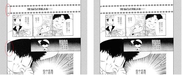
If you don't know what gutter shadow is, it's that dark stripe near the crease of the book where the spine is, which results from the page not being perfectly flat when it was scanned. For somewhat moderate gutter shadow, you'll want to remove it before leveling, or else removing it later will remove art as well. Select the dodge tool, set it to 20% exposure on highlights. What this does is lightens the already lighter area that you use the tool on, hopefully removing the gutter shadow and making those areas white, while leaving the darker art intact. You don't have to remove all gutter shadow now (sometimes you can, it just depends), remove what you can but don't degrade the actual art. Use a large pixel, low softness brush for this step - large enough to let you be lazy, for most raws this means 30-100px and 0% hardness.

The raw image (left) has a very heavy gutter shadow on the left edge. By using the dodge tool on this region, some of this shadow can be removed. In this case, the remainder of the shadow will be removed after leveling.
1.3) Leveling
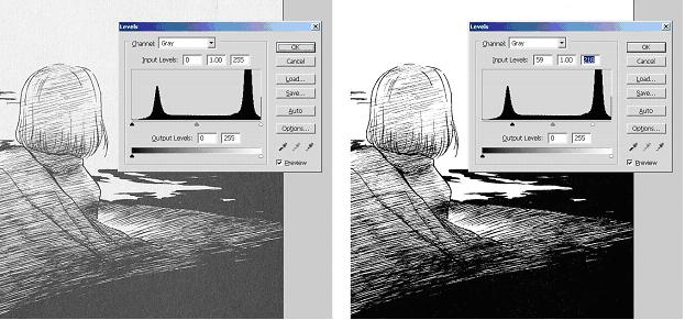
Because of how Photoshop renders various zoom levels, for this step it's best to zoom in to a "round" zoom level (50%, 100%, 200%, etc., 100% works nicely; this is dependant on how you have photoshop configured, read up about cache levels for more info). Press CTRL+L with the background layer selected, this should bring up a histogram. There should be 3 small arrows on the histogram, one on the left, right, and middle. A typical histogram will have 2 major peaks. Move the left arrow to the right, usually a little past the major left peak. This should make the dark pixels darker. A nice way of finding out just how much you need to level is, at one of the rounded zoom levels, find a nice blob that should be solid black (it'll look a dark grey originally, with grey noise pixels). Move the left arrow to the right just enough to ensure that this blob becomes a nice solid black. Avoid overleveling, and making grey areas with art into big black smudges. The middle arrow should almost NEVER be adjusted (if you know when to adjust this, you probably don't need to be reading an edit guide). It will automatically move as the left and right arrows are adjusted, but the numerical value should remain at 1.00. Move the right arrow to the left, usually just past the rightmost peak, mirroring what you did with the left arrow. A nice way to find out how much you need is to find a text bubble near something with grey shading. Move the right arrow to the left enough so that you no longer see any noise (really light grey pixels) surrounding the raw text, but not so much that the light grey shading becomes white. Try to preserve as much shading as possible. Technically you can use the eyedroppers as well, but you might miss a bit if you happen to pick a noisy spot as your endpoint. If need be, you may need to level partially, then manually dodge the remainder of the white regions to prevent leveling away shading, or vice versa with the black.

Note how, on the left, regions that should be white are light gray, while regions that should be black are dark gray. By adjusting the left and right arrows, what should be black is black, what should be white is white, and by leveling only as much as is needed to this end, for the most part the grays are preserved.
Some people say to level just to the peaks. The problem with this is that each of the "hills" you see on the histogram is basically a gaussian distribution of "black" (well, more generally of shading). All of it *should* be one tone. The problem comes in that that hill isn't just the distribution of that color, but also of similar colors (e.g. the left histogram hill for black includes what should be black as well as what should be dark gray). If you make it all black (or white or whatever), you're overlevelling, and you've lost some of the dark grays. If you go just to the peak though, you'll notice specks of gray here and there that should be black. As I mentioned though, in some cases it may be better to underlevel just to the peaks, and finish the rest off manually. A nice way to visualize what's being leveled off the endpoints is to hold ALT while you adjust the slider arrows.
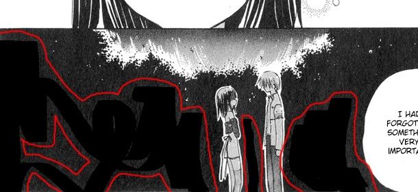
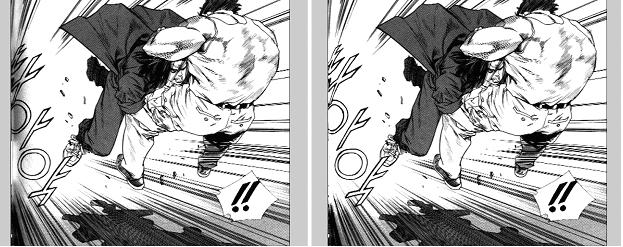
Make sure your monitor is properly calibrated, so what appears to be black actually is black. A common mistake is to use a solid black eraser to clean text or stray marks in what appears to be a solid black region, only to have that region be dark gray instead. If you have an LCD monitor, look at the screen from a non-perpendicular angle - differences in darkness are generally more noticeable this way.

Here you can see where poor monitor calibration or tired eyes resulted in underleveling. Were there not stray marks, this mistake would only seem slightly awkward. However, in an attempt to clean up this region, a black eraser or brush was used on a region that was not actually black.
An alternative to leveling is using curves (image>adjustments>curves or ctrl+m). It's a bit more complicated to use, but can do everything leveling can and more. For basic things though, it's a bit more clumsy than just leveling, and it often helps to bring up the image histogram (window>histogram) since the histogram isn't displayed in the dialogue as with levels. Since it's not that much better than levels for most manga purposes, I won't go into how to use it, but you can read here for more information if you're interested.
1.4) Light and Heavy Gutter Shadow Removal
Hopefully if you dodged before leveling, you'll only be left with light gutter shadow and shadow that, in leveling, became solid black (oftentimes in the corners). Erase the solid black ones manually, either with the eraser tool or with the rectangular marquee tool, then deleting the selected area. You may need to clone stamp or redraw some art to get rid of this solid black shadow, but hopefully any art that you have to redraw was unsalvageable in the first place (otherwise you should've removed it before leveling). The light shadow should be removed as mentioned before, with the large soft dodge tool. Sometimes you will still remove some of the frame borders as you dodge, and will have to manually redraw it. If you rotated precisely enough, using a 1-2px 100% hardness paintbrush, simply click on existing frame pixels, press and hold down SHIFT, and drag vertically or horizontally to draw a perfectly vertical/horizontal line. If it's not vertical/horizontal, either manually redraw it or click one corner, press shift, then click another corner on the other side of the degraded frame to draw a straight, but not vertical/horizontal, line. You may need to go over the line a few times to obtain the proper thickness and darkness.

Note how, after leveling (left), a bit more of the gutter is gone (as well as dirt elsewhere in the page), and going over the gutter again with the dodge took gets rid of pretty much all the gutter shadow. The remainder may need to be cleaned with the eraser tool.
1.5) Gutter Glare Removal
Sometimes, a few pixels to the side of the center gutter, there will be a long vertical stripe of glare. Just as gutter shadow is typically more prevalent on the left page of 2pg raws, gutter glare is more common on the right page. You generally won’t notice it unless there is a dark shaded frame or a solid black are that, on this stripe, remains grey even after leveling. Use the burn tool (an alternate form of the dodge tool), set to 10% exposure, shadows, and again with a large soft brush, and run it over this stripe. What this does is darkens the medium darkness pixels, helping to make dark pixels darker. You can also set it to midtones rather than shadows, depending on which pixels you want to darken; midtones is a bit more forgiving, but you may need to use higher exposure.

Notice the image on the left seems to have a stripe of glare near the edge, manually burning these regions ensures what should be black is black (normally you’d fix the warping and rotation on this page too).
1.6) Erasing
Hopefully you know how to erase the text in text bubbles without much trouble. To minimize switching back and forth between layers, sometimes it's useful to erase all the text at once. Just remember that you can always go back in your history, and at the very top will be a snapshot of the original image, so if you ever need to check back at what text was in what bubble, you can do so. Make sure you also erase any specks that don't belong, often a scanning or printing error. A quick way of cleaning the margins (assuming your page is rotated properly) is to just use the rectangular marquee tool to select the entire margin, then hit delete.
Text on art is a lot trickier. Using the clone stamp tool (100% hardness, appropriate brush size) and defining a source area with appropriate art or texture, clone over the raw text to essentially redraw the art that was covered. Don't be fooled by seemingly solid grey areas; oftentimes this grey shading will actually have a faint grid pattern. Clone accordingly, an easy way is to define your source point at a 'grid' intersection, then begin stamping on another intersection near the covered text. Make sure these 'grids' line up, and if not, redefine your source point and restamp. Personally I prefer to clean things to the point that, if desired, I can move the text to a completely different place and still have it look fine (completely redraw, not just whatever you need to fit under text). Granted this takes a lot more time, and sometimes it's nearly impossible to redraw to that extent, but for the sake of qc, revisions, and just general quality, it's best to redraw completely before you typeset at all (editors who know better sometimes still leave visible cloning artifacts because they didn't look at the art before putting any text on).

By defining the source on one of the more grainy “spots”(left), I know have a reference for lining things up by later selecting a target that’s also one of the more grainy spots. The clone stamp tool is shown in action on the right, but note the slight tone mismatch, an issue that can be resolved either with the healing brush rather than clone, or by simply redefining the source to a region more closely matching the target.
What can get tricky are gradients, or gradient swirls. If you clone as you would normally, when you're done, you'll notice that you have something that looks altered. This is where the healing brush tool comes in. Depending on the size of the brush and the art that you need to fix, the settings of this brush vary, but generally high (100%) hardness is good, and otherwise just use leave default values. Make sure the brush is set to sampled, and use a fairly large brush size. Select an area with a pattern similar to what your target pattern should look like (i.e. if it's supposed to be a grainy gradient, use a grainy area as your source. The pixel darkness pattern is more important than the absolute darkness). Then, as you did with the clone stamp, healing brush over the artificial looking region. This should smooth things out. The tool roughly works by taking your source pattern, applying it to the target, and then adjusting pixel darkness so that it blends in with the pixel darkness around the target area. Be careful about using it near frame borders, and make sure all text is gone before using healing brush (unless you have enough source to get rid of all the text at once), since the solid black text/border will be included in the darkness calculation, leaving you with a dark smudge near the text/border.

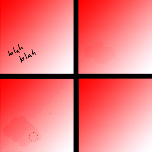
For the sake of demonstration, a contrived color page is used as an example. Original is in the top left. After cloning, there is an obvious mismatch in tone (top right) since the source was not properly aligned (in this case, not perfectly diagonal from the target). The healing brush tool is used over the entire miscloned region (could also be used directly on the text without initial cloning), and again the source is not properly matched to the target (bottom left, tool shown in action). However, the tones do not need to match with the healing brush, only the pattern, which in this case is a smooth diagonal gradient; so the healed area preserves this same diagonal gradient, but when you release the mouse button, the healed area automatically adjusts tone to its surroundings, resulting in a properly matched image (bottom right).
1.7) Reconstructing Art
Sometimes, no matter how careful you were, you simply have to buckle down and do things manually. This relies entirely on your artistic ability, and healing brush/clone stamp/paintbrush/eraser will be your best friends. Learn to use the other settings of burn/dodge as well as the sharpen/blur tools to match your art to the original. If it's a quick fix, consider fixing gutter warp (clone stamp frame edges and art, redraw as needed, pay attention if there's grey shading with warped grid undertones). Of course, if you're going to fix a frame on a page, fix all the frames on that page. There's really no formula for doing this, you just need to learn your Photoshop tools and be good at drawing.
Some helpful tips though.
- Instead of trying to draw some curves/objects, it's easier to get a rough sketch, then with the eraser or clone stamp tool, 'shave' off bits and pieces until it's the right shape, instead of trying to get it right all at once. Remember to blur/sharpen and dodge/burn as needed to match the sharpness and tone of the surrounding art.
- Capslock gives you a more precise and less obtrusive crosshair-like cursor for many of the tools, such as clone brush (but also eraser and the like) that helps in more accurately defining source art and applying it to target art.
- As a time-saver, you essentially can have 3 different erasers, each with different brush size, for quick and precise erasing - eraser, clone stamp (and appropriate white source), and white brush (press X to invert colors, which is usually black on white).
- Remember, SHIFT+clicking gets you an instant straight line between points, and holding down shift lets you draw perfectly vertical or horizontal lines.
- You may find it helpful to copy/paste from elsewhere rather than attempting to clone, thus giving you the option to rotate and distort the pasted region. When distoring or transforming selections, holding down the shift key generally gives you mathematically precise transformations (rotation at regular angles, transformation/sizing at fixed height:width ratios, etc.).
- A general understanding of the different layer blending modes is also useful, especially linear burn.
- Original art is NOT sacred. Generally you want to leave original art alone, but it's ok to fudge a line or shape somewhat to get the reconstruction looking right.
- If you ever need to retexture things, one way is to just find a sample, try to pick out a homogenous section, select it, and define it as a pattern. You can then use pattern fill to retexture. Another option is to use screentones. http://psychobob.xepher.net/screentonez/ has a nice collection that might help. To use, select the region you want using polygonal lasso, quick mask, magic wand, or whatever works best for you (generally I end up using magic wand and quickmask the most), load the screentone (read the site for instructions), and use pattern fill.
- Personally I prefer to leave the original texture and just do the retexturing on a separate layer in case any adjustments are needed, or if you want to adjust transparency to avoid that webcomic look.
- It may help to take a look at some vector tracing tutorials out there. You can also do a gradient fill with pattern overlays to do a pattern gradient, or put the gradient on a separate layer (gives more flexibility with adjusting layer modes).
- Also, learn what contract/expand/feather do, and when to use them.
- In some cases, you may need to use a subtle blur or add some noise in to make the screentone match the surroundings. You may also need to do a bit of healing to avoid seeing screentone edges, a concern more common with large areas.
I've added some tool-specific tips that may help, you can find them here. The harder it is to notice that you did anything, the better a job you did. I know, sometimes, I want to just leave all the ugliness in the image to show people how bad things originally were (since the average leech never sees a raw), but well, resist the urge.
1.8) Resizing
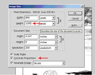
Oftentimes people will like to resize to a fixed height or width for some sense of consistency (one or the other, both is problematic considering relative vertical:horizontal margin thicknesses can become skewed, especially when art contacts image edges), in which case simply go to image size and change the appropriate dimension. Make sure you constrain the proportions; otherwise you'll be left with stretched art. If they do insist on both height and width, resize one, let the other dimension automatically resize, then use canvas size to 'crop' the other. Most groups use 1100 or 1200px height and appropriate corresponding width for what's considered decent quality.
In general you want to resize after you've done all the redrawing you'll need to (but before you put down any text, since text size will automatically scale, sometimes to odd point sizes; if so, you should resize them back to even sizes, warped text notwithstanding), but this is not always necessary, and some redrawing is much easier after text has been placed.
Never resize up (with image size, if you want to increase margins with canvas size, that’s fine). You should never try to fake raw quality that you don’t have (if your raws are only 1000px high, don’t try to stretch it to 1200). Although proper filter use can sometimes let you stretch as high as 110% without much loss, generally unless it’s less than ~20px, don’t resize up (i.e. if you have 1200px height raws, your crop/rotate cut it down to 1195, go ahead and resize up to 1200).

Input the desired height; be sure to constrain proportions.
Some people say you should change the resolution to 72 pixels per inch, and there are reasons why you may want to do so (this is where point and pixel sizes coincide for typesetting), but it’s really not a necessary step considering the output image (the jpg or png) will ultimately default to 72px/in anyways. Admittedly, other resolutions may cause you to work with small font sizes, and if you find yourself needing smaller font increments than 0.5 (not actual font size, but like, if 4 is too small and 4.5 is too big so you need to go down to 0.25 increments or less), you probably should change resolution. On a side note, if your group specifies what font size to use, this generally means at 72 resolution, so you may want to change it if you aren’t confident in your ability to properly size text from appearance. If you only work with one standard size, you may want to just set an action for resizing, and if this is the case, you can go ahead and include the resolution change in the action.
1.9) Fine Touches
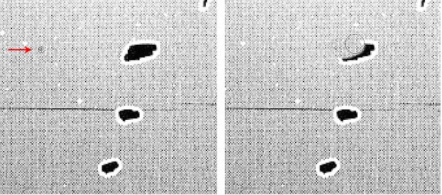
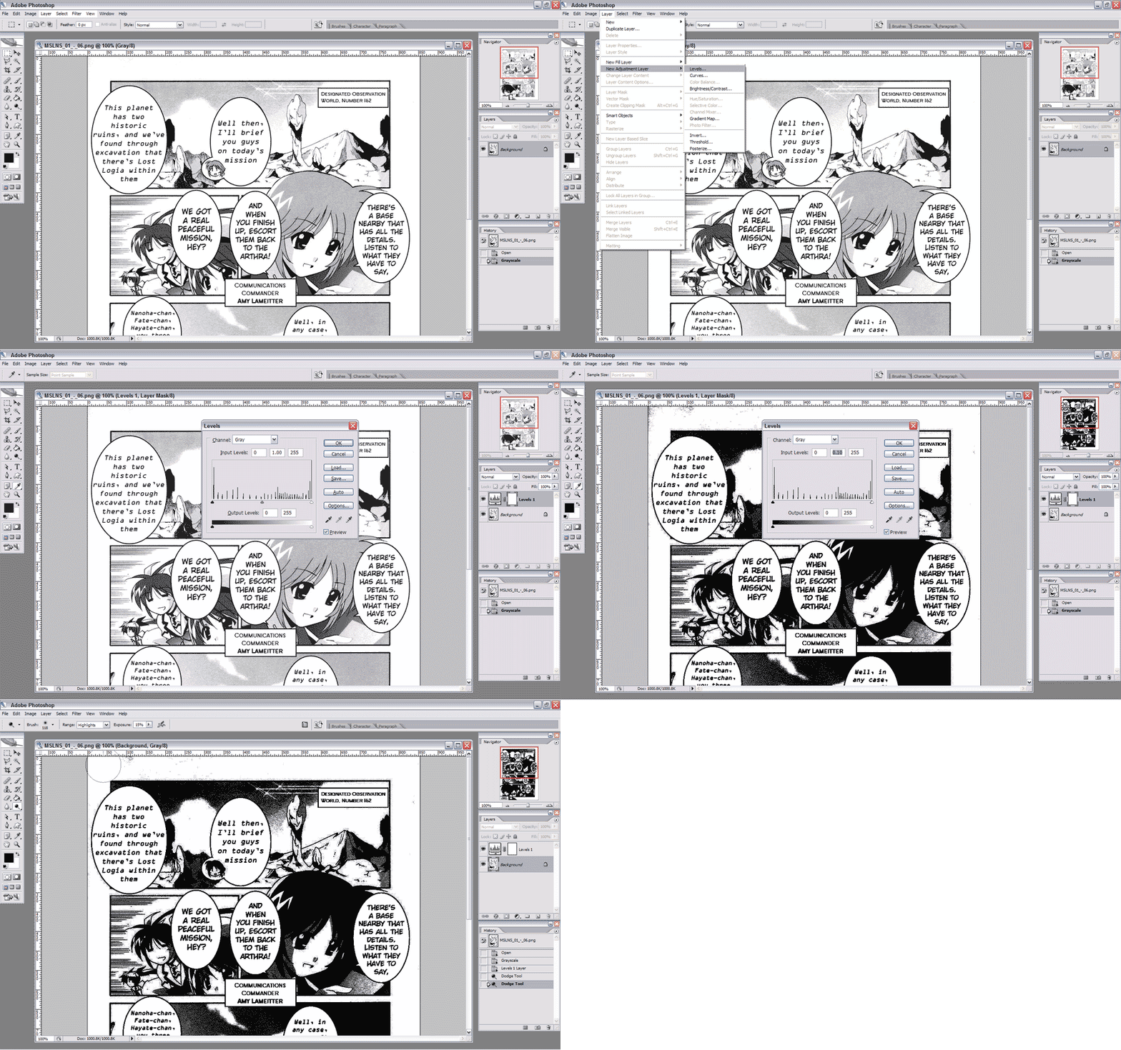
Once you're pretty much done cleaning, make sure you've eliminated any stray specks in the art. In particular, with some scans, there may be specks and smudges too faint for the visible eye, but are still there nonetheless. The easy way to check for this is to create a levels adjustment layer. To check for specks in white regions, create a levels adjustment layer (Levels>New Adjustment Layer>Levels) and drag that middle arrow (the one I told you to almost never touch) all the way to the right (you can also just drag the left arrow all the way to the right). You should see that everything turned a lot darker, and any specks previously invisible now appear a black or dark gray. You can then select your background layer and erase it (make sure you erase the speck on the background, as opposed to erasing a hole in the adjustment layer). Oftentimes, since these specks are normally rather faint, you can also use the dodge tool on highlights to erase them without worrying as much about damaging the art (you still can degrade lineart, so don't go overboard).
The same goes for checking the black areas; just drag the arrow all the way to the left this time, and use the brush or burn tool (or inverted eraser or clone or whatever) to clean up the specks. A common mistake occurs when editors have their monitors set on low contrast, so dark gray looks black; as a result, they "erase" text into solid black without realizing the error, so attentive readers end up spotting where text was erased or art reconstructed. Checking the black in this method helps ensure you don't make this mistake. When you're done, just turn off or delete the adjustment layer. This step is usually optional, since a few stray specks usually make little to no difference (exception being the black erasing mistake), so I don't always do this in my edits (I'm lazy).

You may not notice specks at first, but applying a levels adjustment layer can show you what you can't see. You may think it doesn't matter if you can't see it, but the .png format prefers large contiguous regions. By removing these faint but present artifacts, you can noticeably decrease the filesize. Make sure you're cleaning the background layer, and not erasing holes in your adjustment layer. Don't forget to turn off or delete the adjustment layer once cleaning is complete.
Index
Cleaning Scans
Typesetting
Saving Files
Advanced Stuff
