Text Bubbles
Now that we have the fonts, and the clean, resized scans, let's begin typesetting. I recommend adding in the text layers before you delete the Japanese text from the scan, since you'll be sure as to where the text is supposed to be placed. But before that, click on the Text Tool icon, and set the following tool properties:

In this case, I'm using Wildwords as my main text font. As far as font size goes, it's important to be consistent. Pick a size that will fit in most of the text bubbles, and only shrink it when it's really necessary (sizes are usually 12-14px). Next, set the antialias (aa) to "Smooth", and click on the centered icon. With that done, you're ready to start filling in the bubbles. Simply draw a text box in the bubble, and type in the translation. Then, center the text box in the bubble, and format it so that it "fits" the bubble.


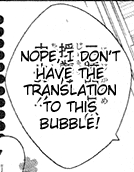
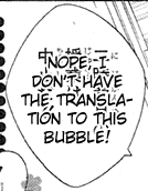
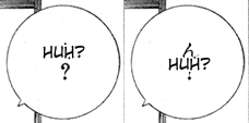
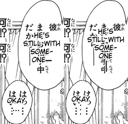
To see why I mean by formatting, look at the above two bubbles. The one on the left is what you'd naturally getting if you type out the "translation". However, the one on the right looks better because the text is in the shape of the bubble. To get the one on the right, I just manually went in and hit Enter right after the "I" on the first line. The rest of the text automatically changed position, and now fits the bubble much better. Another thing to make sure of is that the text is centered, both vertically and horizontally, in the text bubble:

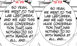
The next issue is text size. Let's say that you've chosen font size 14px to be your "standard" font size in the manga. You still need to keep an eye out for when 14px is too big, and shrink that particular bubble accordingly. In this example, shrinking the text size 1px makes it fit comfortably.

The final point is styling ellipses and dashes (that is, whether to do them vertically or horizontally). I personally find either way to be acceptable, but typing them horizontally is quicker. The group you join may have a preference. One way to make the long, connected horizontal dash is to use the font "Wide Latin". Simply highlight the double-dash in the text bubble, choose the "Wide Latin" font, and it will turn into the connected long dash. The vertical dash is the line tool, set at a width of 2px.

One final note: Always add in punctuation at the end of a text bubble, even if there isn't any in the Japanese text bubble (or the translation). This just makes it look more professional. If no punctuation is given, it's usually safe to just add a period or ellipses.
Once all your text is typeset (and you know it's all in the right place), add all your text layers into a set, hide the set, and brush over the Japanese text with a hard white brush. Un-hide the text layer set, and all your bubbles should be perfect.
Styling Text ->

